


What Is Periwinkle, Exactly?
Periwinkle is a soft, dusty shade that sits right between blue and purple. If you’ve ever looked at a clear sky just before sunset, or a pale lilac bloom catching the morning light, you’ve probably seen periwinkle without knowing its name. The color gets its name from a small flowering plant, and that connection to nature is part of why so many people find periwinkle so soothing. Unlike bold blues or deep purples, periwinkle feels gentle. It doesn’t shout for attention. Instead, it settles into a room, an outfit, or a design project and quietly makes everything feel a little calmer.
Periwinkle in Nature: The Flower Behind the Color
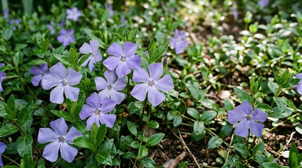
The flower that gave periwinkle its name is Vinca minor, a low-growing evergreen plant found across Europe and parts of Asia. Its small, five-petaled blossoms bloom in that same pale blue-purple hue we now call periwinkle. Gardeners often use the plant as ground cover because it spreads easily and tolerates shade well. Beyond its practical use, the periwinkle plant has carried symbolic meaning for centuries, often associated with early memories, friendship, and gentle beginnings. Knowing the flower behind the shade makes it easier to understand why periwinkle feels so organic and easy to live with.
The Psychology Behind Periwinkle
Color psychology suggests that periwinkle blends the calm of blue with the creativity of purple. Blue is often linked to trust, stability, and relaxation, while purple carries a sense of imagination and individuality. Periwinkle sits right at that intersection, which is likely why it’s become a favorite for spaces meant to feel both peaceful and inspired. You’ll notice periwinkle showing up often in bedrooms, nurseries, and meditation spaces, where the goal is to create a sense of ease without feeling flat or boring. It’s a color that invites you to slow down, but it still has enough personality to keep a room from feeling sterile.
How to Use Periwinkle in Your Home
Bringing periwinkle into your home doesn’t require a full renovation. A single accent wall painted in periwinkle can soften an entire room, especially when paired with warm wood tones or soft white trim. If painting feels like too big a commitment, start smaller: periwinkle throw pillows, a ceramic vase, or curtains can introduce the color without overwhelming the space. For kitchens and bathrooms, periwinkle tile or cabinetry offers a fresh alternative to the more common white or gray palettes. The key with periwinkle is balance. Because it’s a muted, pastel tone, it pairs best with other soft colors or warm neutrals rather than harsh contrasts, which can make it look washed out.
Periwinkle in Fashion and Design
Periwinkle has had a steady presence in fashion for decades, moving in and out of trend cycles without ever fully disappearing. It works particularly well for spring and summer wardrobes, where its lightness feels seasonally appropriate. A periwinkle blouse or dress tends to flatter a wide range of skin tones, which is part of why designers keep returning to it. In graphic design and branding, periwinkle is often chosen by companies wanting to feel approachable and trustworthy without leaning on the more corporate feel of navy or the more playful feel of bright blue. It strikes a middle ground that reads as thoughtful and modern.
Pairing Periwinkle with Other Colors
One of the most useful things to understand about periwinkle is what it pairs well with. Soft yellows and creams create a cheerful, spring-like contrast, since yellow sits opposite blue-purple shades on the color wheel. Blush pink and periwinkle together create a romantic, slightly nostalgic palette that works well in bedrooms or stationery design. For a more grounded look, pairing periwinkle with charcoal gray or deep navy adds depth while letting the periwinkle still feel like the star of the palette. If you want a monochromatic approach, layering different shades of periwinkle and lavender together can create a surprisingly rich, cohesive look without needing any other colors at all.
Why Periwinkle Keeps Coming Back
Trends in color come and go, but periwinkle has a kind of staying power that a lot of trendier shades don’t. Part of that is because it’s not trying too hard. It reads as calm rather than loud, interesting rather than overwhelming, and that combination makes it easy to keep coming back to, whether you’re repainting a room, refreshing a wardrobe, or choosing colors for a new project. If you’ve been looking for a shade that feels fresh without being fleeting, periwinkle is worth a closer look. It’s the kind of color that tends to feel just as good a decade from now as it does today.
Final Thoughts
Periwinkle earns its popularity honestly. It’s a color rooted in a real flower, backed by genuine psychological appeal, and flexible enough to work across home decor, fashion, and design. Whether you’re drawn to its calming qualities or its quiet creativity, periwinkle offers a shade that feels both timeless and current, which is a rare combination for any color to hold onto.


